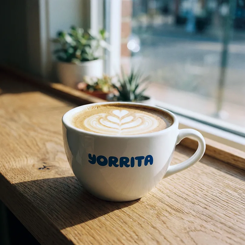
Yorrita is a Slovak specialty coffee roastery founded out of its founders’ long-standing passion for coffee. With a strong competition, the brand needed a distinctive identity that would clearly set it apart.
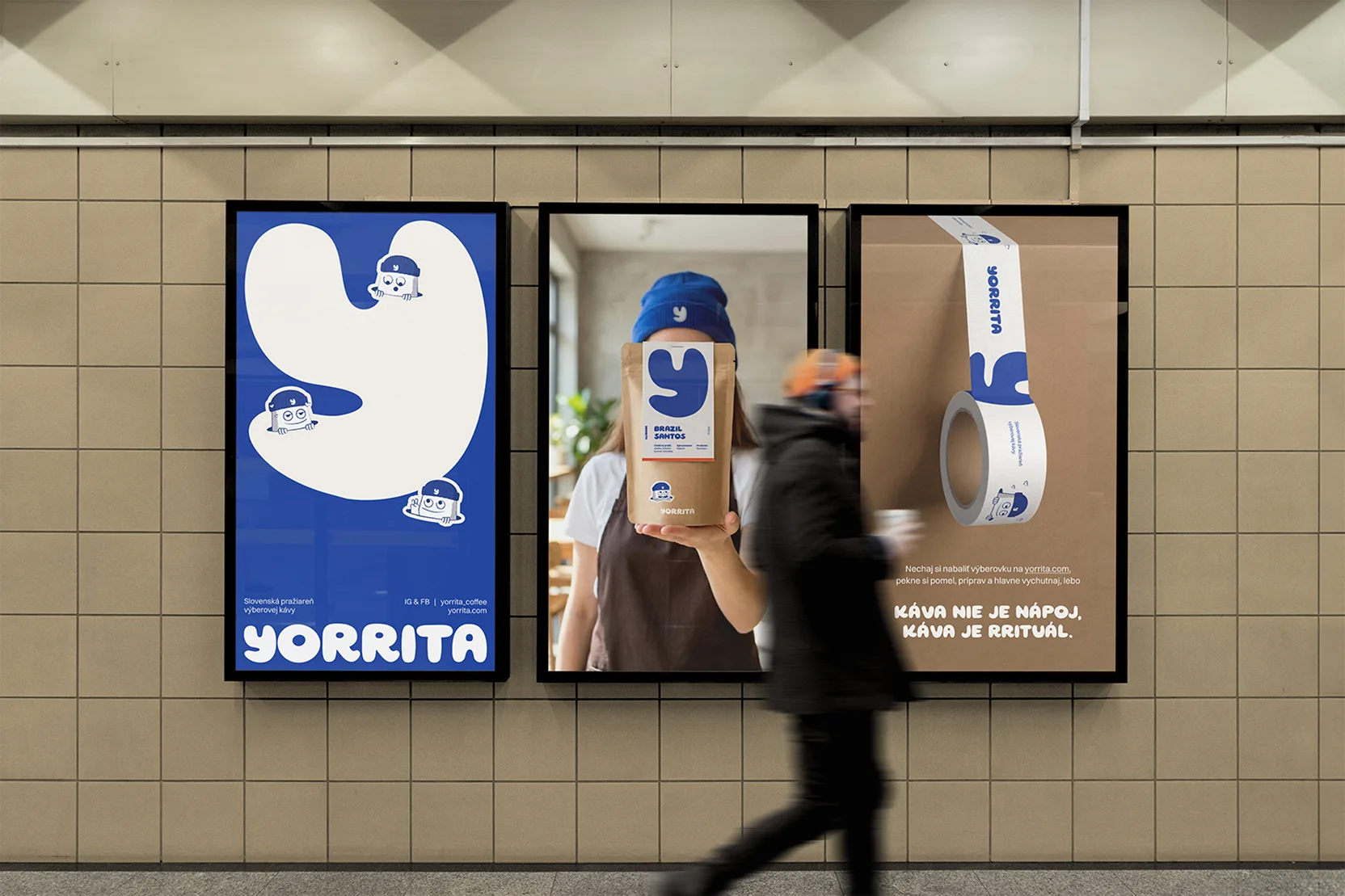
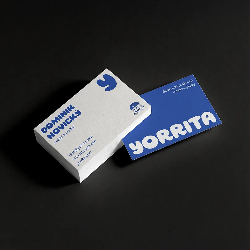
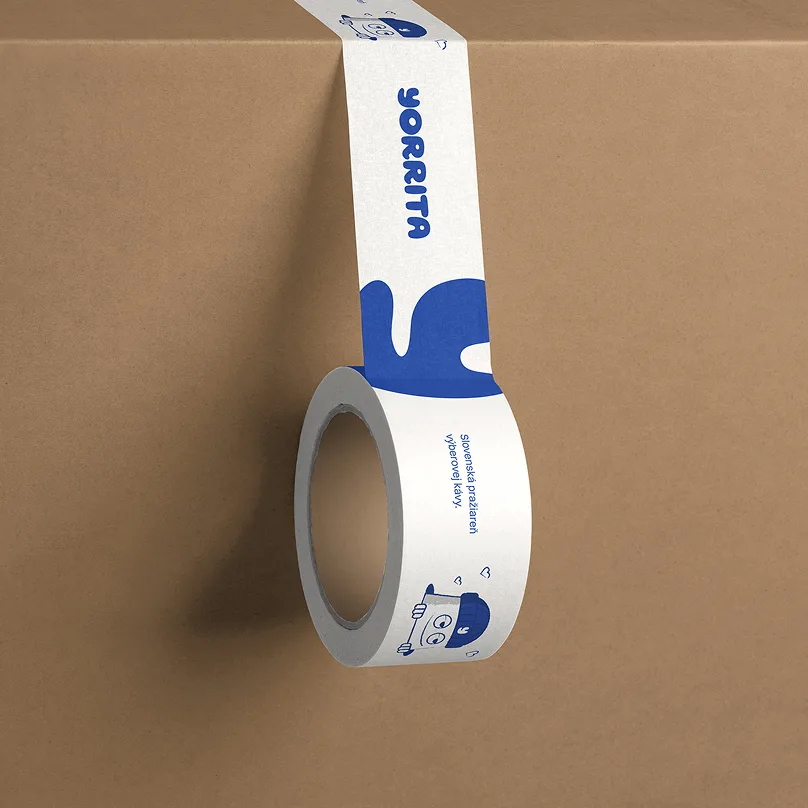
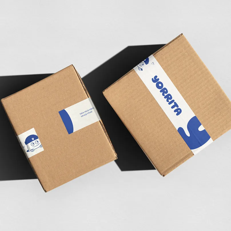
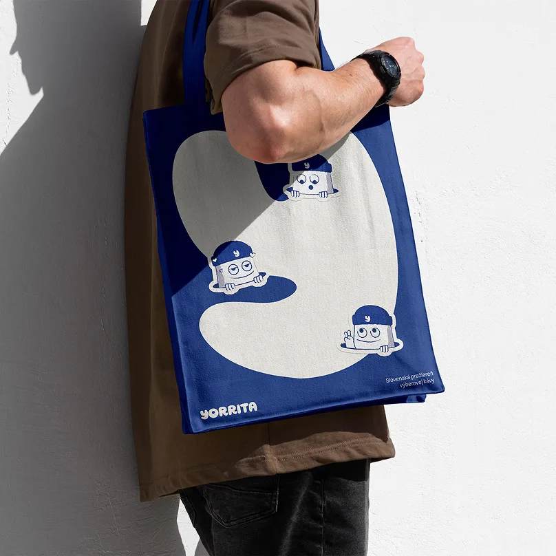
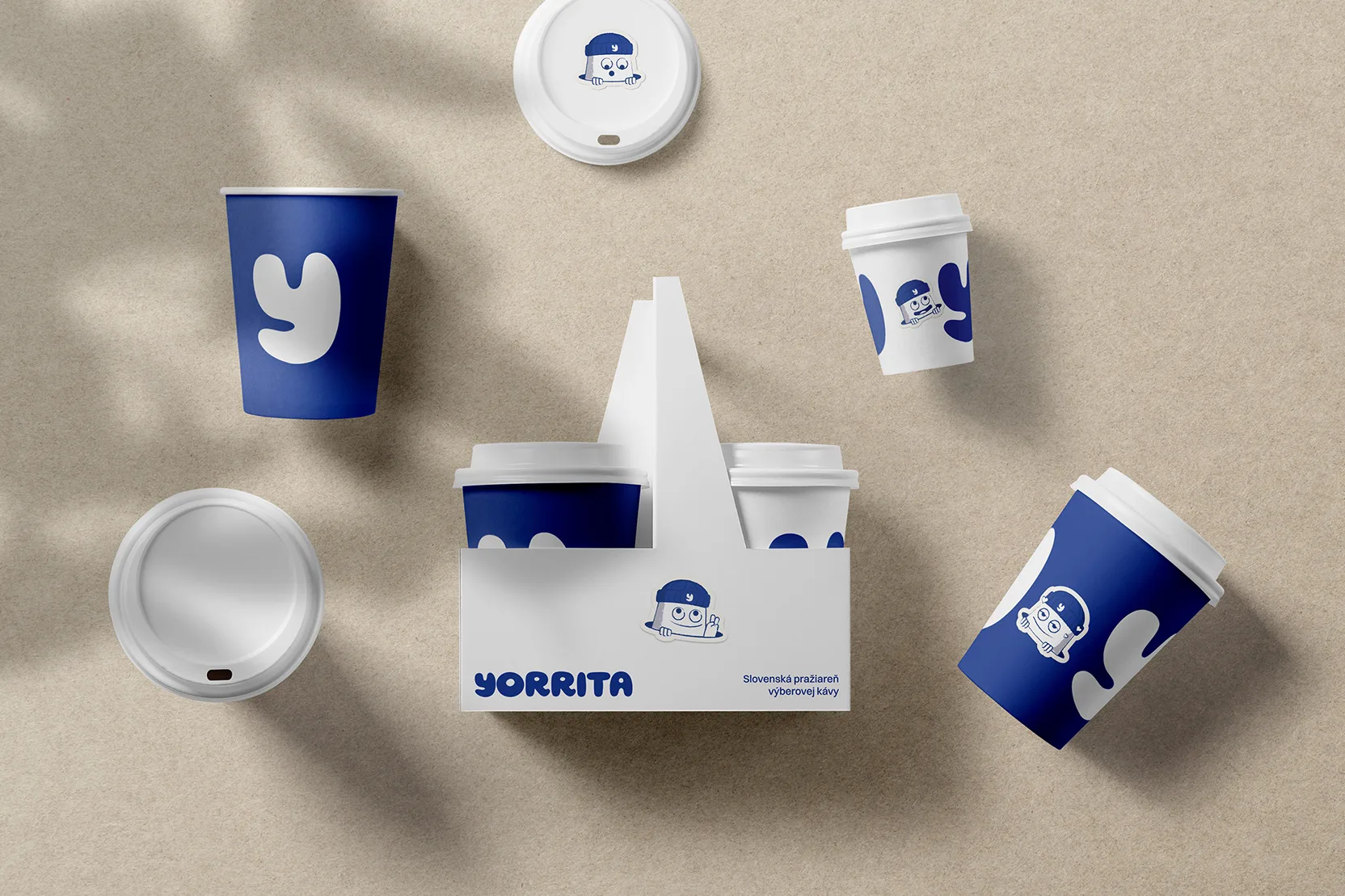
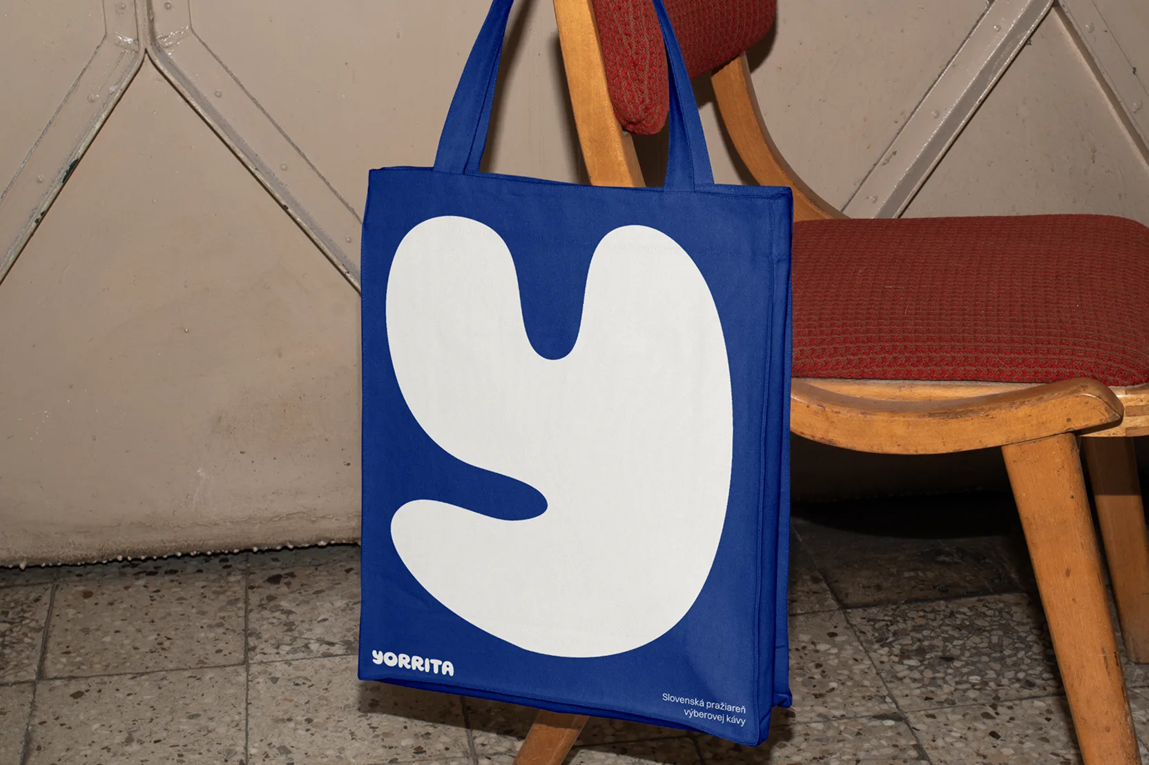
The process began with naming. After an extensive exploration, the name Yorrita emerged as the final choice. It originated from a direction focused on using an unconventional initial letter for the local market – one that could serve as a strong and recognizable brand symbol. Combined with the use of blue in the packaging, this naturally leads to simple associations like “the coffee with the big Y” or “the coffee with the blue Y,” significantly strengthening memorability.
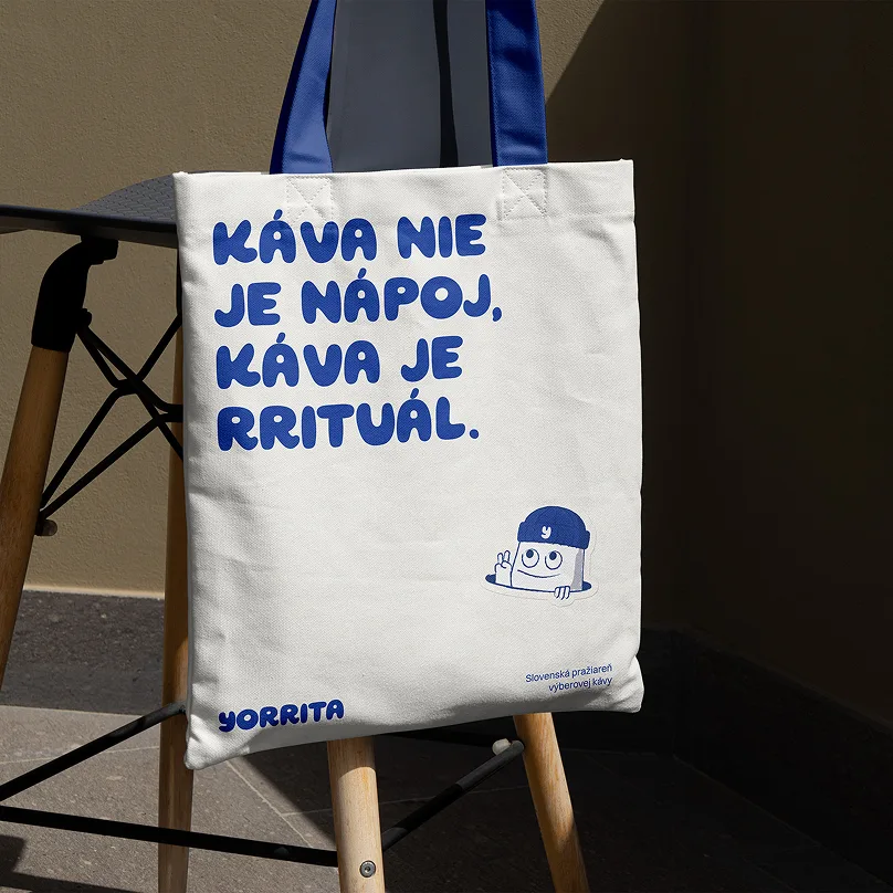
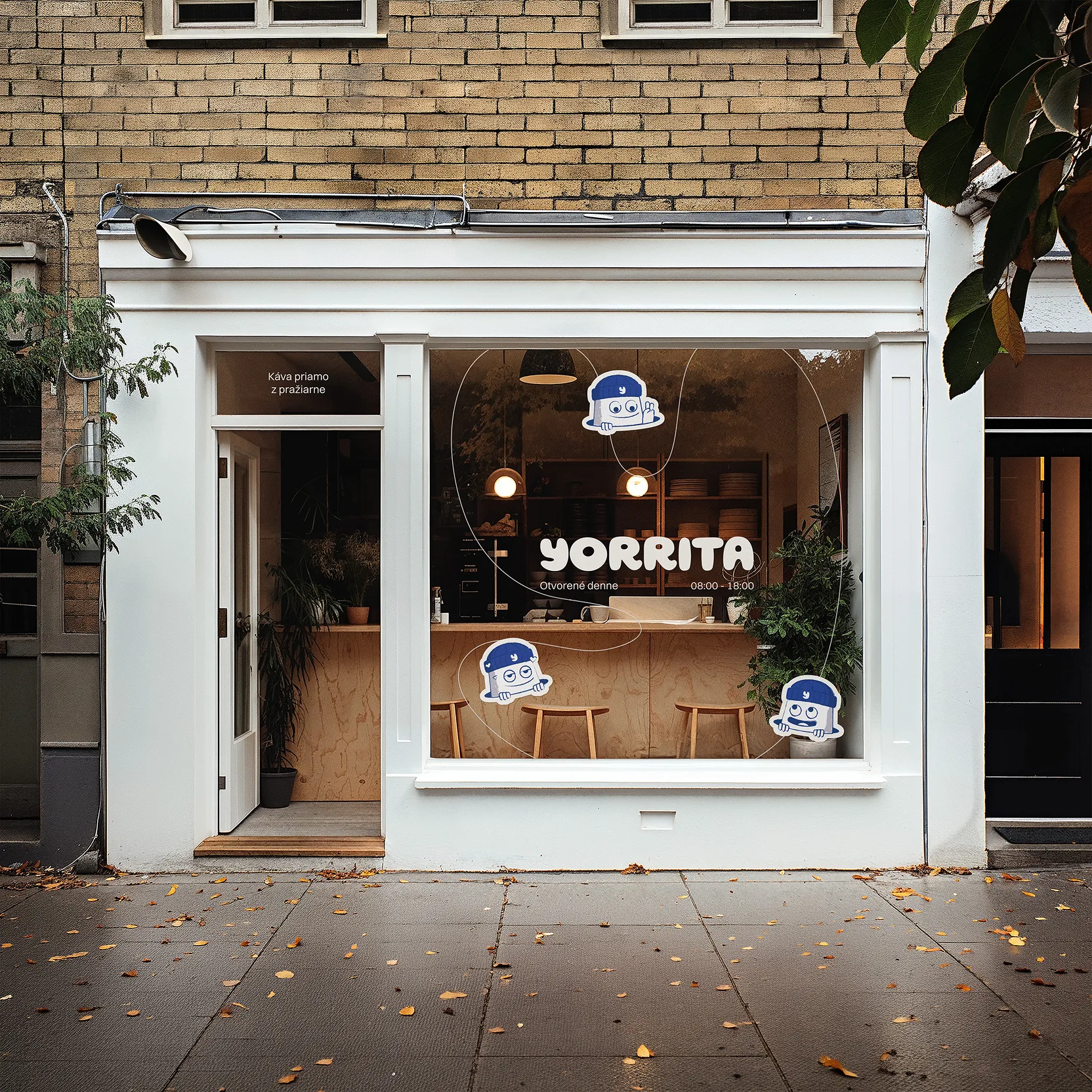
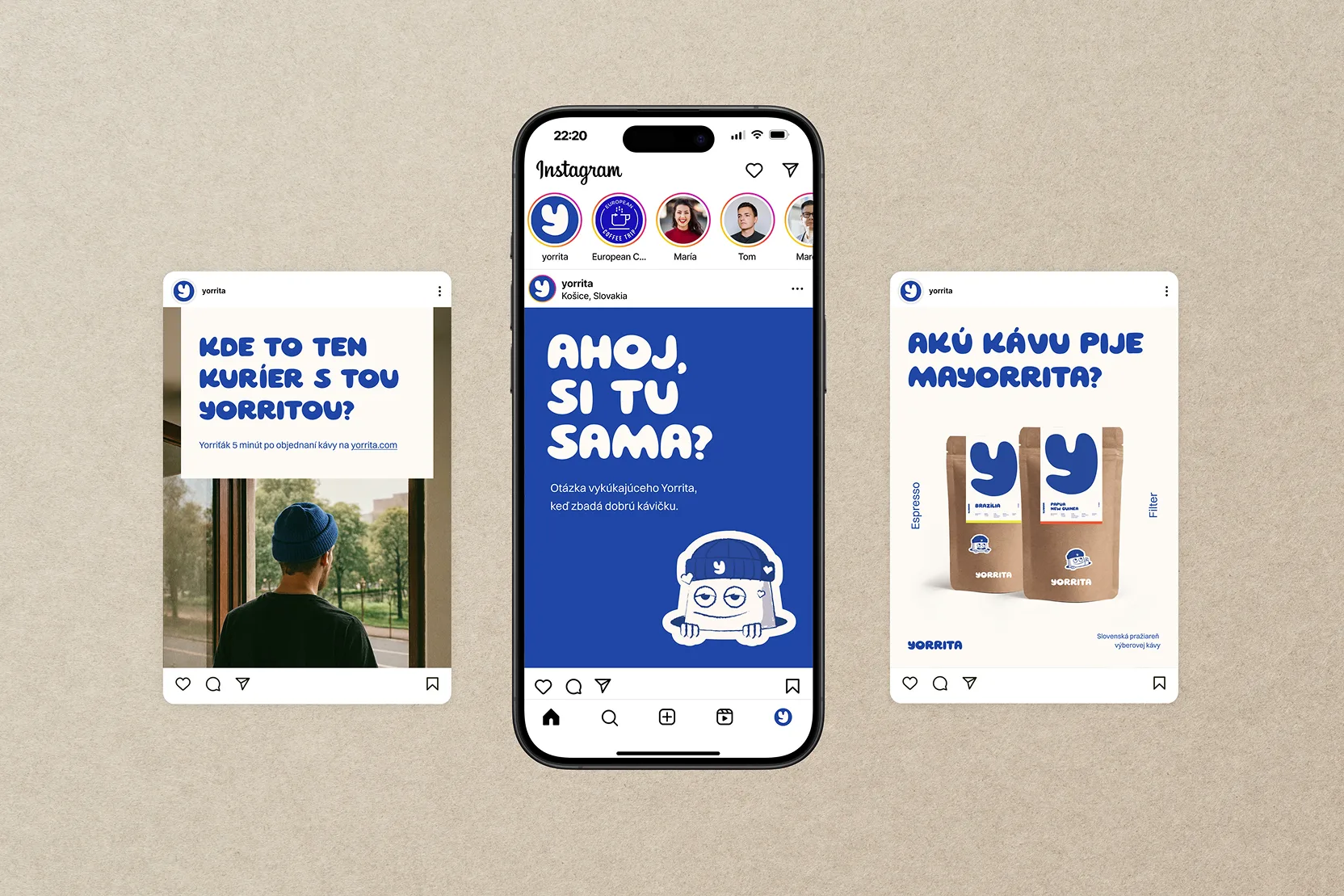
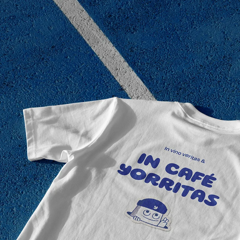
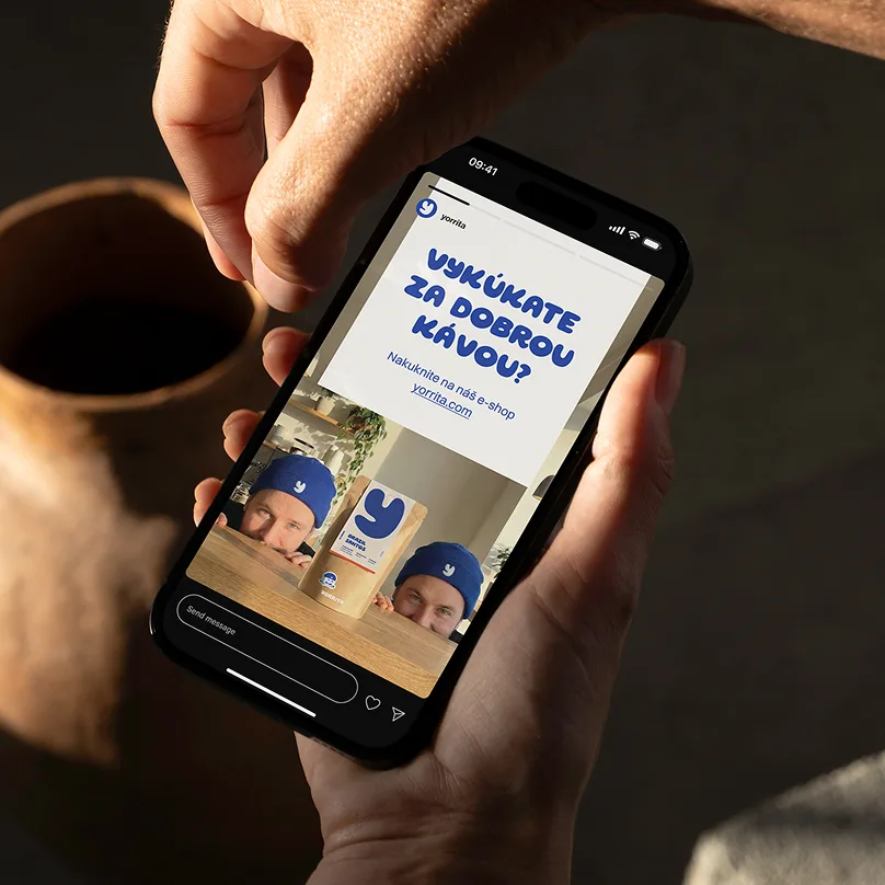
Building on these two core elements, the entire brand story was developed. This led to the creation of small peeking mascots – “Yorritos” – who are constantly drawn to what they love most: Yorrita coffee, visually represented by the bold Y. A key part of their identity is the blue beanie, which also works as an easily transferable brand element in the real world. It helps extend the brand into photography and user-generated content in a natural and accessible way.
From the beginning, the branding was designed to be easy to apply, even with the limited resources of a growing company. Putting on a blue beanie with a Y, taking a photo, or using “Yorritas” stickers is often enough to bring the brand to life. The system is intentionally flexible, yet simple to use.