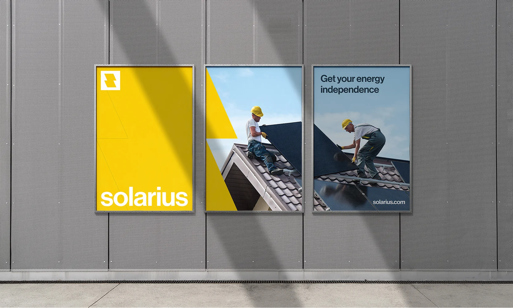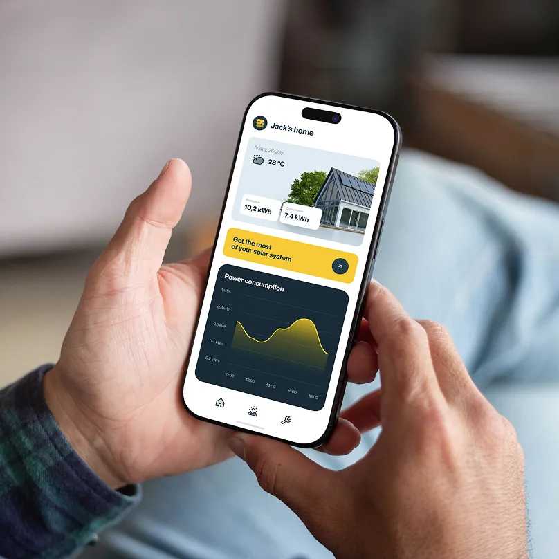
Solarius is a brand focused on solar energy solutions for people looking to get their energy idependence.
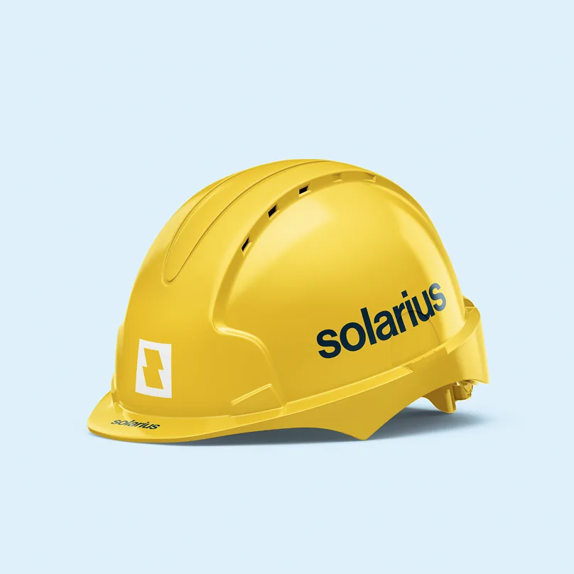
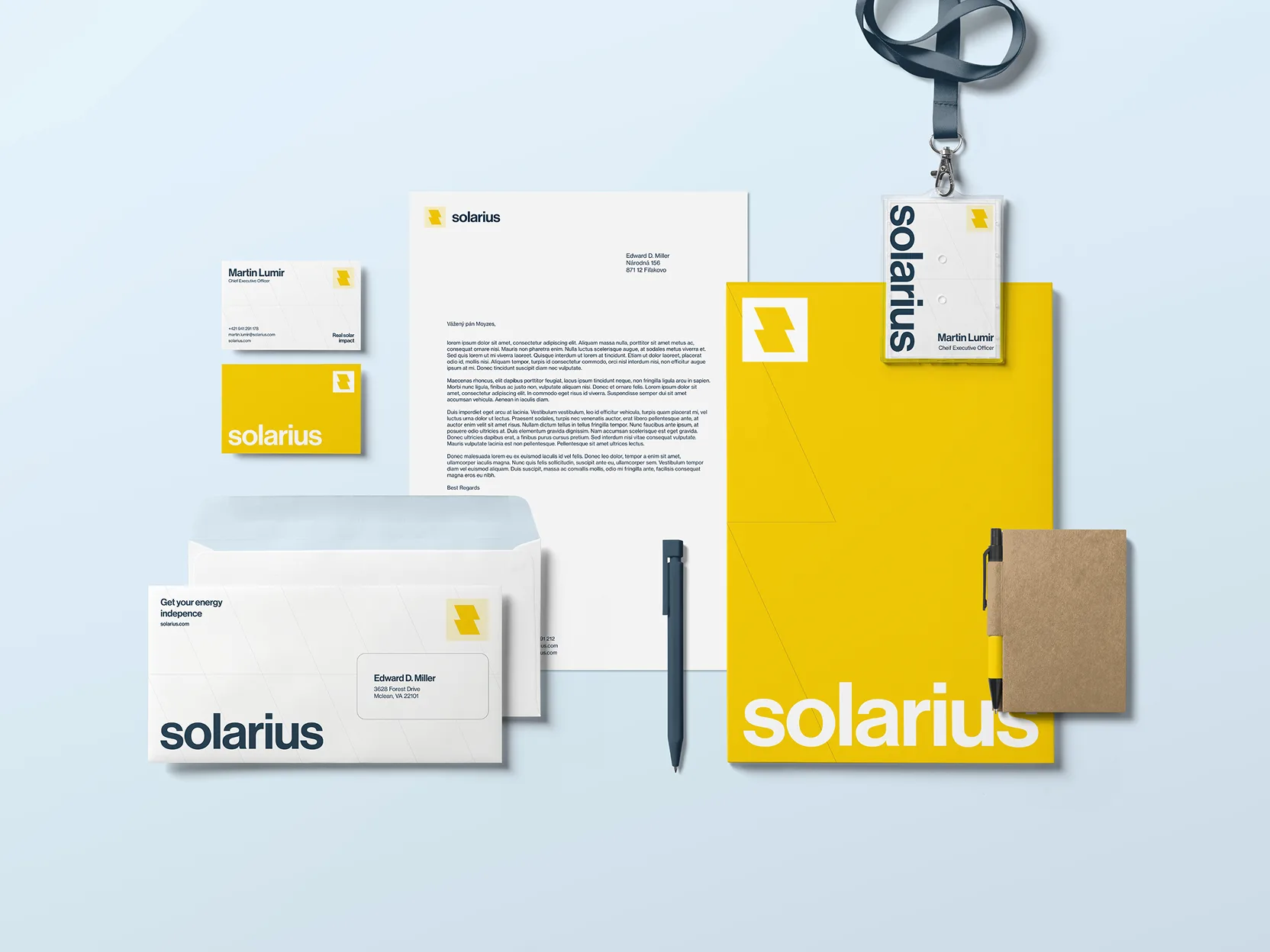
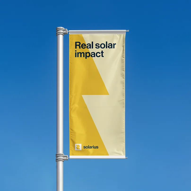
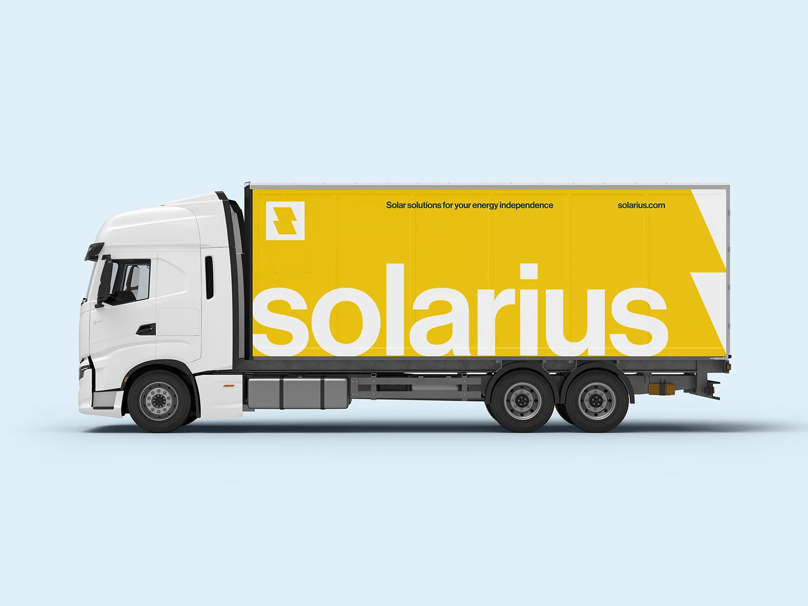
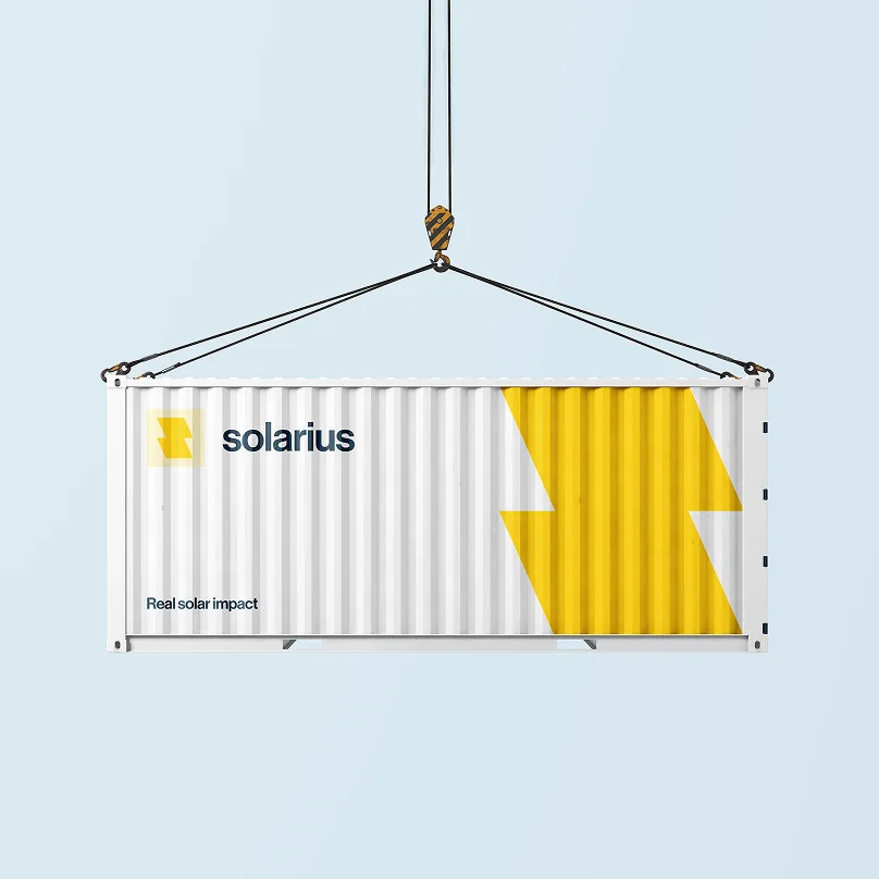
In a market where companies often come across as highly technical and utilitarian, the goal was to create a brand that communicates the core essence of its offering – energy itself. This became the central principle of the identity and is expressed visually through a bold yellow accent color used consistently across all touchpoints.
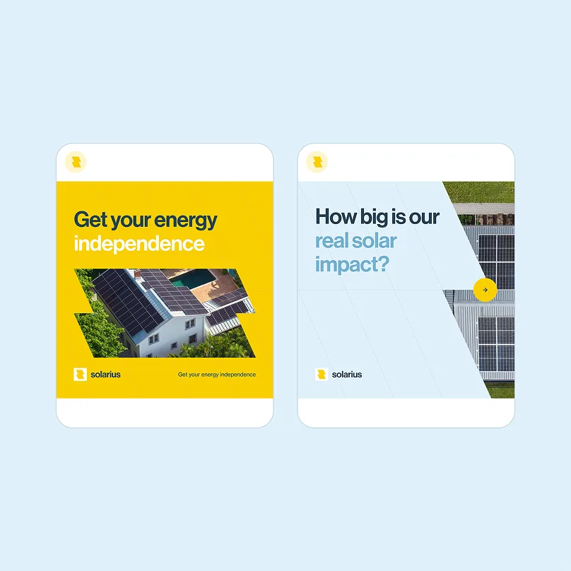
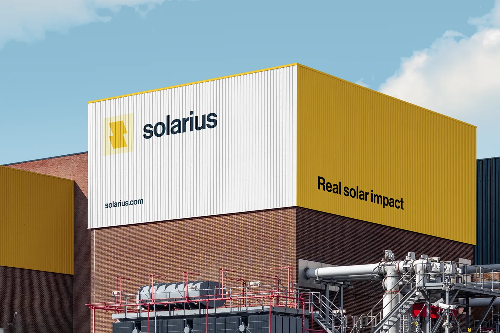
Another key element of the identity is the silhouette of solar panels. This motif is reflected in the logo, shaped as the letter “S,” and also serves as a flexible visual device throughout the design system—whether as image masks or subtle background patterns.
The project is fictional and was created as part of developing my skills in branding and web design. It draws on experience from similar real-world client projects.