Bergdoktor
Case study

Network of the eye clinics inspired by Austria

Client
Bergdoktor
© 2023 - 2024
Bergdoktor - logo on a wall of waiting room
Line of business
Eye clinic
Optics
Services
Branding
Web design & development
Type of project
Redesign concept
of previous real project

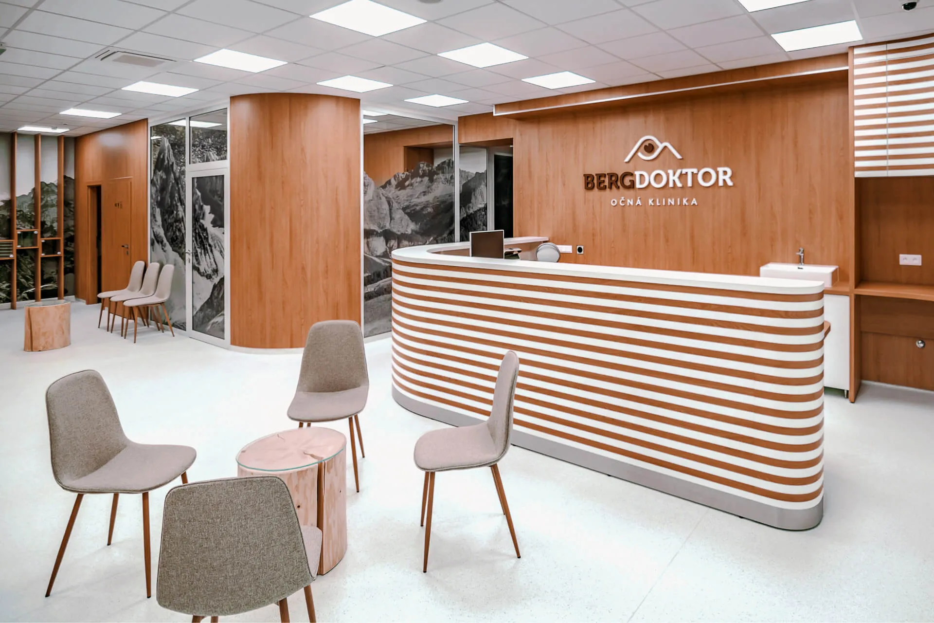
Bergdoktor, as a new eye clinic network on the market, was in need for a new visual identity and website.

I based the design on the appearance of the newly created clinic and the overall concept of the mountains which are included in the very name of the clinic.

The presented design is an author's concept which was additionally changed in several aspects compared to the realized project.

Logo & visual identity

The logo is a combination of a simple shape of mountains and an eye.

The mountains are based on the translation of the name of the clinic into English (Doctor from the mountains) and the eye is naturally the central point of the entire clinic.

Color scheme

Color palette follows complementary scheme.

It contains warm brown tones of design elements and blue tones present in photographs as backgrounds and small accents. Combination of these two creates beautiful color contrast which attracts the eye of visitors.

Brown sugar
#C77552
Bistre
#381D12
Pure white
#FFFFFF
Polynesian blue
#1F4780
Seashell
#FFEEE7
Web design & development

After completing the visual identity, website was the next step.

It provides clients of the clinic all-in-one place where they can find all the information about the clinic, its services and where they can book an appointment.

Next project
Čačko - digital signage systems
Cacko.eu

Have an idea?
Let's put it on the web!

Hand holding green ball as a symbol of catching your new website